Skip to content
Menu
Home
Joshua Maruska
Principal Designer
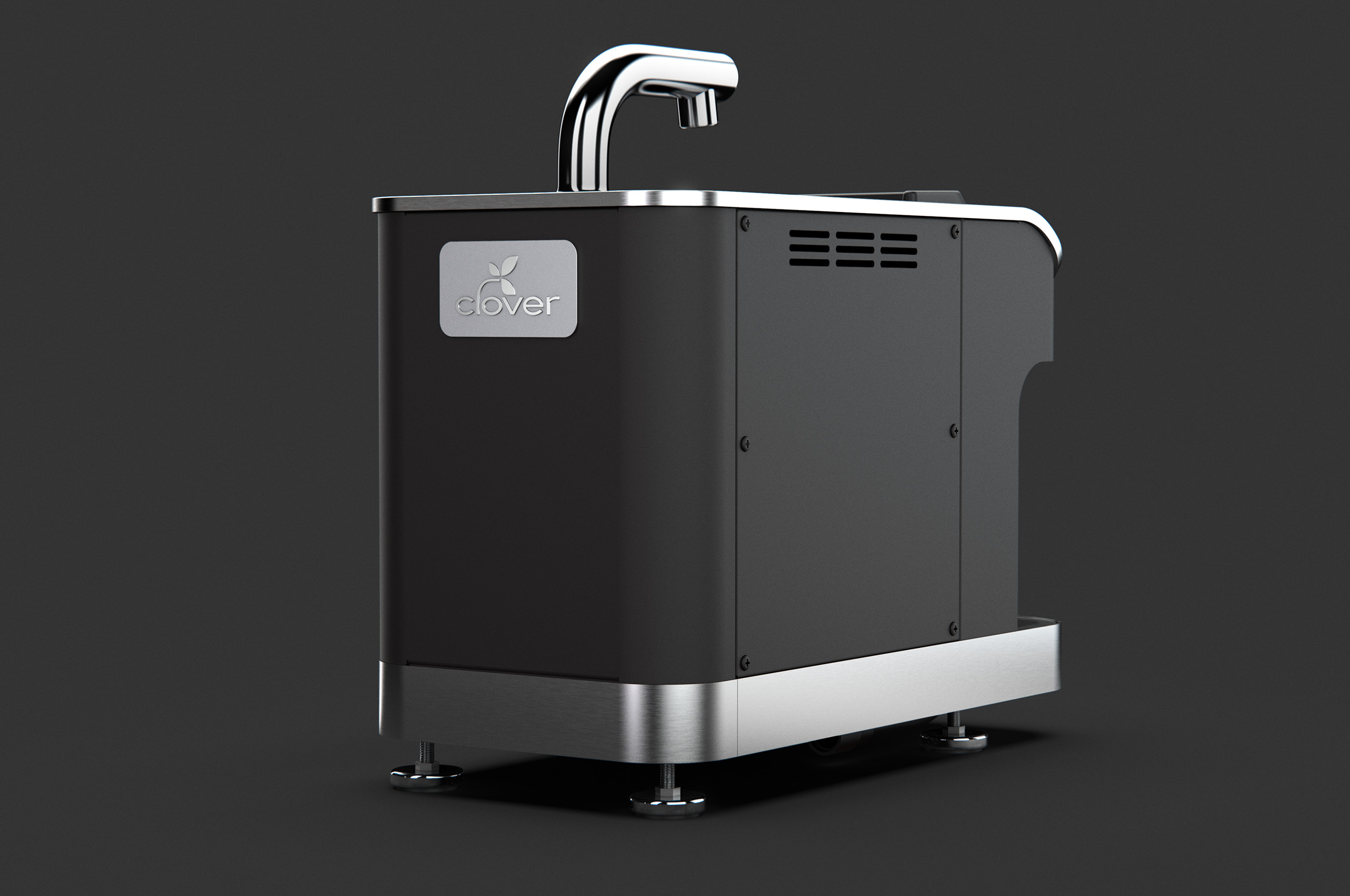
Clover 1s
Type:
Industrial Design
Post navigation
Previous Project
Intel Dream PC
Next Project
Microsoft Shell Laptop